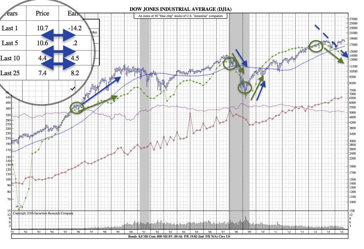
DJIA Followup from Last Weeks Selloff — 25-Year Chart
Following up on last week’s article that covered the $DJI ‘s selloff – which was attributed to the tranquility that has enveloped markets for more than two months as central banks start to question the benefits of further monetary easing, sending government debt, stocks, and emerging-market assets – we take a look at the 25-Year Chart to search for more insight and answers as we move forward.
Thursday, the DOW was up to 18,212; with Apple leading the way for most of the week. The world’s largest company (Apple) confirmed that initial quantities of its iPhone 7 Plus have sold out globally.
Also contributing to the week’s success: initial jobless claims remained under the 300,000-mark for another week, continuing the longest stretch since 1970. The number of new claims for unemployment benefits in the U.S. rose 1,000 to 260,000 in the past week, more than an expected increase to 265,000. (The Street)
But looking at the 25-Year Chart, it appears as if a fall in prices may be in order. The 25-Year Chart is set to a 15:1 PE scale, and that is noted when Price and Earnings intersect.
The first three convergences; 1995, 2007, and 2008 all show a strong correlation: as earnings move, price follows.
That being said, the last convergence took place in late ’14/early ’15 and earnings have since fallen 14%. If the correlation is as strong as it appears to be, the $DJI is set for another selloff in the near future.