Description
This new package from SRC includes each of the following:
The SRC Book of 25-Year Charts; 2020 Quarterly Editions. Brand New for 2020. Covering 4200 Indices • Sectors & Industries • Companies • and Select ETFs. This new book covers every company in SRC’s database from IPOs in the past year to blue chip stocks. Your annual subscription includes the Jan ’20, April ’20, July ’20 & Oct. ’20 editions – delivered to you in a full-color PDF. (If printed, this set of charts would be 4 to 5 volumes.) To preview the January 2020 25-Year Chart Book including the index – Click here.
You will receive an email each quarter with a link to download the current edition. Perfect for viewing on your PC, Laptop, Ipad or other mobile device. Just click or swipe. And you can also jump to a particular stock, just type in (ticker) with the “find tool”. For example, to view the AES Corp. chart just use the find tool in Acrobat – which looks like a magnifying glass – and type (AES) hit “next” – which will take you to that chart.
And when you order here, you will be given instant access to the latest PDF edition – just save the file, and you are all set.
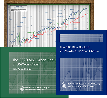
The SRC Blue Book of 21-Month & 12-Year Charts; January 2020 Edition. Covering the 21-Month Charts for the S&P 500, the Dow 65, and the NASDAQ 100. In addition, the Blue Book covers 2,200 of the most widely traded companies on the NYSE and NASDAQ in SRC’s 12-Year Chart format. To preview the January 2020 Blue Book including the index – Click here.
The SRC Green Book of 35-Year Charts; 2020 Edition. Each chart is on its own 8.5” x 11” (full-size) page. Spanning 1985-2020 and including eleven recessions and periods of expansion. A total of 900 companies are included in the 35-Year print edition format. To preview the 2020 Green Book including the index – Click here. Ships early March 2020.
Features
Each stock chart graphically traces the monthly price ranges, relative-to-market performance, 48-month moving average, trading volumes, plus earnings and dividends. In addition, all data has been fully adjusted for stock splits and dividends. Key events in the company’s history are noted. Recessionary periods in the Books are shaded grey.
- Capitalization figures shown at the bottom of each chart are based upon the company’s latest annual report.
- Monthly Price Ranges are read from the right scale. They represent the highest and lowest point reached. The horizontal cross bar indicated the last trade or closing price.
- Adjusted Earnings are read from the left scale and have extraordinary items removed such as discontinued operations, restructuring charge tax benefit, non-recurring charges, investment gains & losses, giving you the clearest earnings performance possible.
- Dividends are read from the left scale and are plotted on an annual basis. Dividends above or below the charts as well as specials, extras, irregular payments, etc. are noted.
- Relative Performance Line is read from the right scale. This line indicates whether the stock is outperforming, lagging or keeping pace with the general market as represented by the S&P 500.
- The Moving Average is plotted monthly and read from the right scale. This represents the average of the closing prices for the most recent 48 month period.
- Volume is plotted on an arithmetic scale at the bottom of each chart. The vertical bars indicate the number of shares traded each month. Thousands are indicated by a T at the top right of the volume scale, millions by an M and billions by a B.
- Growth Performance Measurement (GPM) is being provided in a block that appears in the top left corner of the company chart. The percent gain or loss for price, earnings, and dividends is shown for specific time periods as indicated by the number of years shown. The figures presented are average annual compounded percent return.
- Key Notations – Significant events in a company’s history, such as an acquisition, divestiture or stock split are indicated on the chart.
- Semi-logarithmic scale – Our stock charts are plotted on uniform semi-log grids. This enables you to quickly compare percentage moves on one stock chart with any other.